
The color palette of your home page—generally the first page your website visitors will see—is the most important design decision you will make. Color has the power to motivate or repel people, and even change the way they learn, think and feel. Not only do specific hues affect and enhance your brand’s message, but the right ones can actually translate into conversions. Analytics expert Neil Patel states that when he altered the color of his home page’s call-to-action button from blue to yellow, his conversions went up by 38 percent.
So as you plan your website design, keep in mind these 13 reasons why the colors of your home page matter:
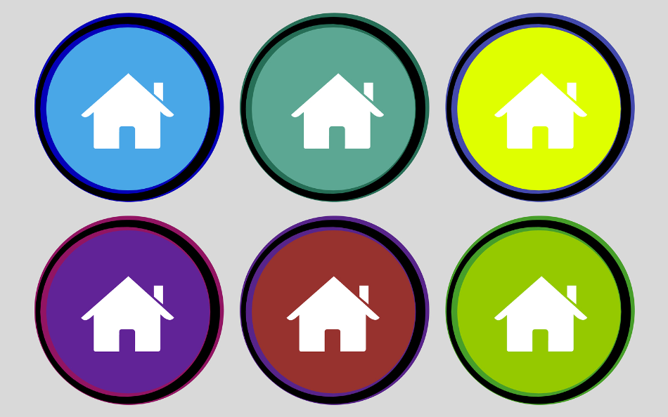
1. People React to Colors
What’s more appealing, a black banana or a yellow banana? Whether you’re aware of it or not, color elicits a variety of emotional reactions, so choosing a well-planned color scheme for your home page will ensure that you avoid the “black banana” reaction. Data shows us that 42 percent of consumers say that the design of a website is the top criteria for judging it, and 52 percent of them won’t return to a site if they are turned off by the design.
Tip: Taking into consideration your brand, you can’t go wrong with the top three preferred colors for a website: green, blue, and orange.
2. Color Motivates People to Buy
When used wisely, colors are an excellent motivator. Those in search of luxury products respond best to color schemes in burgundy, black or white. Impulse shoppers are most likely to be triggered by blue, black, and orange, while budget-minded shoppers respond well to dark blue and green. Consider this: two out of three people won’t purchase an appliance if it doesn’t come in their favorite color.
Tip: Make your call-to-action button red (to create urgency), blue (to imply trust and security) or orange (to encourage taking action).
3. Color is the Strongest Purchase Influencer
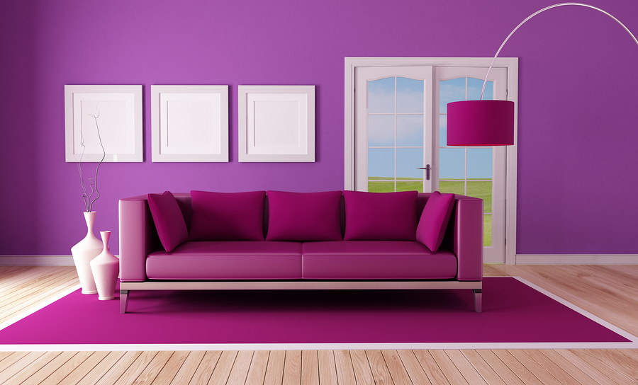
Studies have shown that the color of a room actually affects a person’s perception of the temperature of the room. So warm hues, like orange, red, and yellow, will make you assume a room is warmer, while cool colors, like blue, green, and light purple, will make you think a room is colder.
Similarly, color plays a key role in the decision to purchase a product or service. The average person takes 90 seconds to form a subconscious decision about you and your brand, and 85 percent of the time, the purchase decision is based mostly on product and presentation colors.
Tip: Navy blue and teal speak to shoppers on a budget, and pink, light blue, and rose appeal to traditional buyers.
4. Color Affects Thought and Behavior
The colors around us can actually change the way we think. Researchers at the University of Rochester found that athletes are much more likely to lose if they’re pitted against opponents in red, while students exposed to red were more likely to perform poorly on tests. This is because red can actually degrade our ability to think critically and can cause us to make hasty decisions.
Tip: Depending on what you want your website visitors to do, try red (to increase appetite or invoke a reaction), yellow (to encourage buying), blue (to evoke trust), orange (to elicit a call to action), and black (to provoke a sense of luxury).
5. Color is Memorable
People are much more likely to look at and absorb materials that are presented in color. An overwhelming 90 percent of marketers prefer color presentations to black and white. They believe that color makes it easier for customers to remember their products and services.
Tip: Studies show that the highest-converting colors for call-to-action buttons are bright colors like red, green, orange, yellow. Avoid dark colors such as black, dark gray, brown, or purple because they’ve been shown to have have low conversion rates.

6. Color is Meaningful
The colors you choose for your website tell the world a lot about your brand. Blue is associated with safety, security and trustworthiness, which is what makes it the most popular choice for insurance websites and financial companies. The use of green suggests growth, health, and eco-friendliness. Warm colors like red, orange, and yellow invoke excitement, energy, and passion.
Tip: Check out this chart of color meanings and brands.
7. Different Demographics Like Different Colors
As you build your color palette, design it around the tastes of your target audience. For instance, younger people prefer brighter colors, while older folks prefer subdued palettes. Both men and women prefer green to brown, and women are better at perceiving colors than men are. No matter what demographic your audience belongs to, there is a color choice to match.
Tip: Blue is the preferred color of both men (57 percent) and women (35 percent), which makes it a good bet overall. For a predominantly male audience, add green and black, and for a mostly female market, include purple and green.
8. Colors and the International Marketplace
It’s easy to assume that colors mean mostly the same things around the world, but the truth is that colors have wildly different meanings between cultures. For instance, Western society views white as the color of purity, but some Asian cultures see white as a sign of bad luck. Green represents money in the United States, but obviously not in countries where the money is a different color.
Tip: Blue, azul, bleu … whichever way you say it, keep in mind that 40 percent of people across the globe say that blue is their favorite color. Oh, blue.

9. Web Page Colors can Enhance or Diminish Featured Images
If your page features product images or important graphics, you’ll need to choose a color palette carefully. Highly-saturated background colors are not only distracting, but they also tend to make images look washed out. If your web page features a lot of rich imagery, tone down the background color scheme to make your images stand out.
Tip: Coordinate image and layout colors to suggests harmony, which positively affects web page visitors.
10. Contrasts Make People Take Notice
Some people assume that only the large blocks of color in the background or graphic elements count. However, the colors that you choose for key elements such as links, headings, calls to action, and other details are just as important, if not more so.
Tip: Choose contrasting colors, as well as a shadow effect, for elements you want to stand out, like buttons. But do this sparingly, as overuse will have customers wondering where they need to look, if everything looks important.
11. Certain Colors Make Your Website Seem Faster
Choosing one color over another won’t actually speed up or slow down your website, but, because of the way that colors affect people’s emotions, they can make your website feel faster or slower. Red is an energetic color, which makes users feel antsy and impatient. On the flip side, blue has a calming effect, so users are more likely to stick around while a blue page loads.
Saturation and brightness play into the feeling of speed as well. Both dark colors and highly-saturated colors are more exciting, which can add to your viewers’ impatience. Colors with low saturation and those that are bright (pastels or colors mixed with white) are more relaxing, which makes page load times seem shorter.
Tip: Include colors like pale blue, green, pink, and lavender to encourage relaxation because relaxed people are more apt to view download times as shorter.

12. Colors are Part of Your Brand
People are 80 percent more likely to recognize and remember a brand based on its colors. That means you’ll need to choose colors that align with your company’s values as well as the products and services you have to offer. If your business is already well known for a particular color, then you’ll want to make sure that your web design is based around the same palette.
Tip: Think about some common brands and notice how their primary color pops into your mind: Starbucks (green), Chase (blue), Shutterstock (red), and Apple (white).
13. Not Everyone Has Perfect Vision
With all the design choices to make, it’s easy to forget that 75 percent of all Americans have less than perfect eyesight. It only takes a few seconds for visitors to navigate away from a website that is difficult to read. That means that, above all else, your color choices should be easy on the eyes.
Tip: Create stark contrasts between text and background colors. Red, blue, green, and yellow are ideal colors for those with visual impairments, especially for call-to-action buttons.
Consider the tips listed here carefully, and then test out a variety of color combinations so that you can choose an effective scheme that not only looks great, but also motivates your audience. Good luck!
RELATED POSTS: