
Regardless of your project, first impressions count. People take fewer than two-tenths of a second to form initial impression. In the marketing world, people study a headline image for fewer than six seconds, and that’s only if they like what they see. The longer they look at the image, however, the more favorable first impression. Every marketing project, from a blog post to an event invitation, requires its own powerful set of images. And, for each task, it’s something a little different.
In a general sense, great stock images are bold. They suggest activity, and inspire the viewer to take action. And, of course, the best stock images are high-quality and technically “perfect.” Yes, there are plenty of ways to encourage action or influence your audience with images, and here’s how you can make those images work for you in a variety of projects.
Website Design
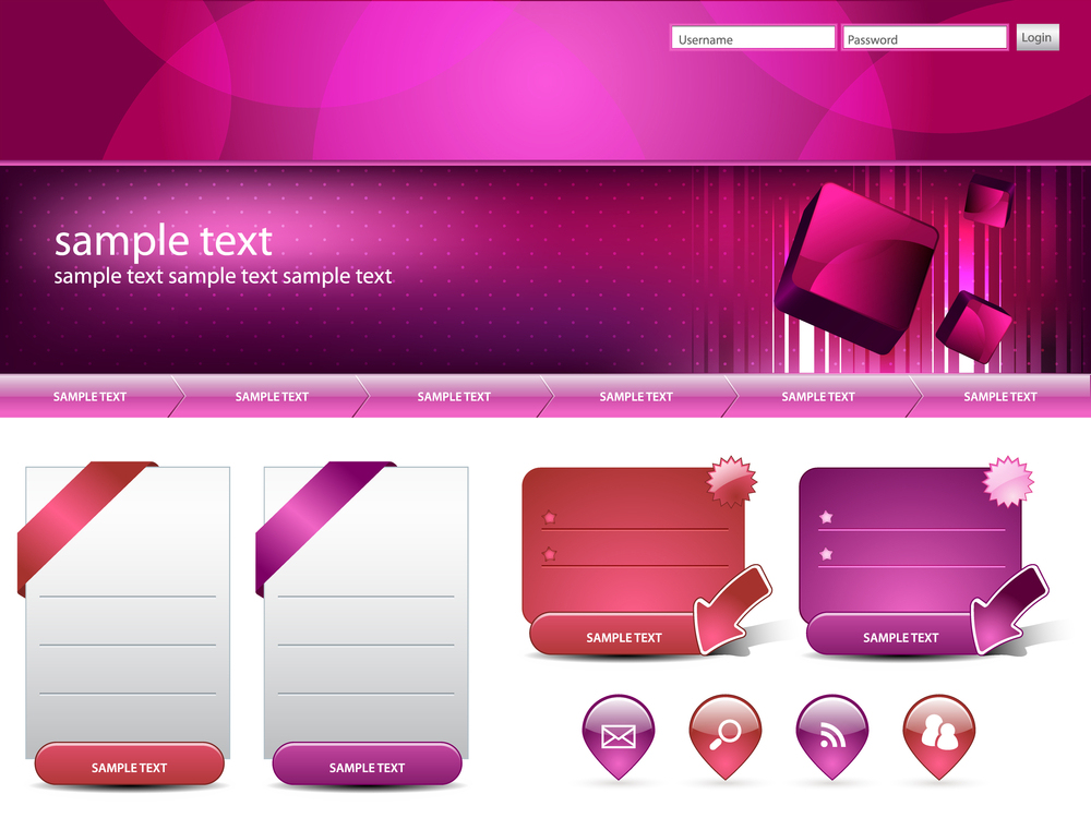
When it comes to website design, visitors need to immediately understand your product, so be sure to use clear images that relate to your site. Keep images to a minimum though, so pages load easily. The difference between .4 seconds load time and .9 seconds cuts traffic by 20 percent. Product photo templates, webpage templates, graph templates can all benefit from stock images.


Social Media Profiles
The very things people like best about social media should inspire your image selections here. Keep your images, warm, friendly, inviting, and, if appropriate, humorous. The most effective images on social media are the ones that are relatable and clear.
For profile photos for your business, dark or medium colors work best. Try blues, greens, or purples – and avoid busy patterns.
Product Brochures & Catalogs
For product brochures and catalogs, get creative with product shots (like background settings, as shown in the Product Photo Template, below). Whenever possible, show potential uses for the product, so that customers can see it in action. Ideally for catalogs, one photo per product is plenty. And remember, people look at images first, so be sure to put product photos at the front of the brochure, and at the top of catalog listings.

Online Advertising
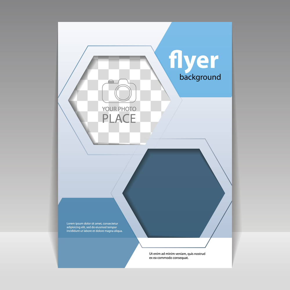
For website templates and product photos, place images toward the top of the ad. Effective images are ones that are warm, engaging, or show interesting uses for the product. Sixty percent of people are more likely to call a company when their online ad includes an image.

Blogging
Images not only need to catch attention, but they need to help tell a story. They also need to elicit emotion and, of course, be relevant to the post. Effective images include emotional photography, hand-drawn images, and infographics. Use 2-3 images per post, putting one below headlines and others to help break up long stretches of content.
Coupons
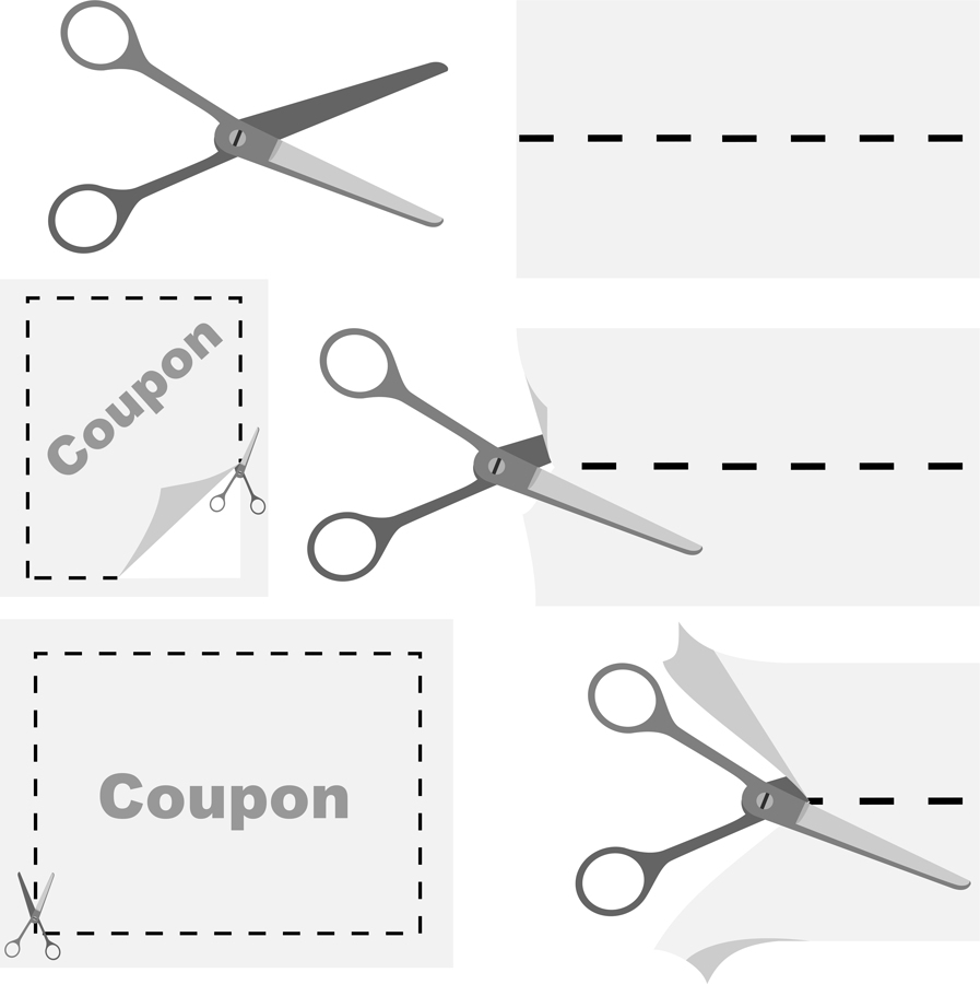
Coupons have the power to entice audiences with bargains, and coupon templates can help make those bargains look professional. All it takes is one product shot and one template. For horizontal coupons, put the discount on the left, photo center, terms and UPC right.
For verticals, put the discount at the top, photo center, terms and UPC bottom. Use simple design (coupons should look like coupons). Never distract from the offer.

Email Newsletters
Use “Click here” buttons, company logos, graphics for header, and enticing photos that are relevant to content and make sense for your brand. Entice the viewer to click on a link or read more about the subject material. Use images sparingly (one header, one “click here” button, one logo, one or two relevant images). Long emails, even with great images, can make readers lose focus.
Also, use simple, uncluttered design, keeping graphic assets in only two or three colors.

Invitations
Use clear, colorful, fun images that help illustrate the theme of the event. Invitees should be able to guess the theme of your event just by looking at the image – so don’t be afraid to go bold.
Also, be sure to use a template that includes a text box, for maximum impact.
Infographics
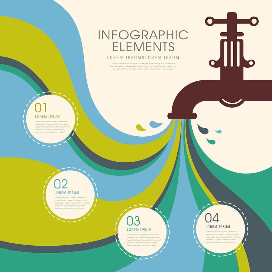
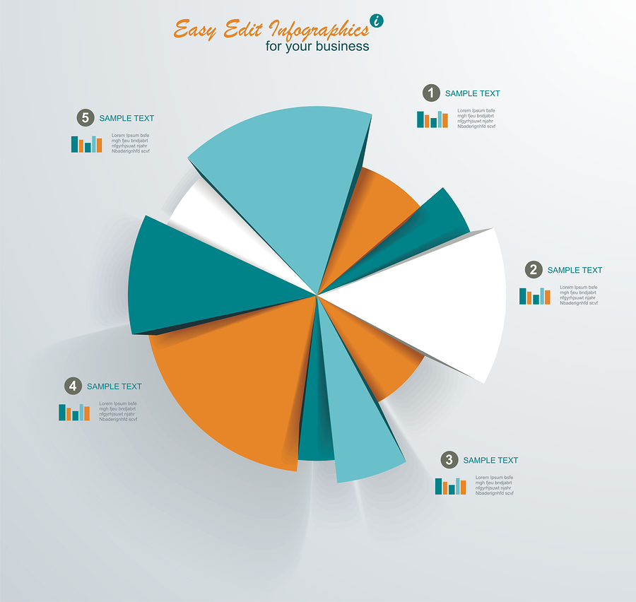
Infographics need a main picture, the “hook” that’ll catch immediate attention. Try and tell a whole story with as many icons and images as possible, using words and/or explanations sparingly. Three-color palettes work best; Use one for the background, and two more to set up other sections. Any further colors should only be shades of the original three. Avoid white backgrounds, neon shades, and dark colors, as these tend to be more difficult to read.

Case Studies & Testimonials
For case studies and testimonials, use strong visuals to emphasize results. Show people using the product. Feature graphs or images that quantify results. People skim text but notice visuals. Ninety percent of information received by the brain is visual. Be sure to use at least one graph, and several images of people, products and results. Remember, readers of case studies and testimonials can get “word fatigue”, so images are also a great way to break up text and give your viewers some visual relief.

Keep this Cheat Sheet handy. And, if you’re looking for some great royalty-free photos and images, check out Bigstock.com.

