Color is the one of the most essential aspects of design – even in cases when you use no color at all. Color, or lack thereof, helps convey your message, so it’s critical to choose the right colors for your projects. The right combination of colors can evoke intrigue, hunger, happiness, and more. The possibilities are endless.
What certain colors represent
In nature, we see trees with green foliage and brown bark. Grass in the field is also green, while the soil is a rich, dark brown. It should come as no surprise that a company selling an “all natural” shampoo brand would choose brown and green for their packaging. These colors are easily associated with nature, growth and earthiness.

© StefanieMohrPhotography/Bigstock
Dark blue represents knowledge, power and integrity, and that is precisely why you will often see big businesses like banks integrating this color into their brand.
Websites for hospitals often use blue, green, turquoise, and silver. These colors, categorized in the cool color group, are considered to have a calming effect. On the other hand, websites that integrate warm colors such as red, pink, yellow, gold, and orange use them to promote excitement. These colors are often found on websites geared towards children.
It is for the same reason we see school buses painted yellow and fire trucks painted red. In fact, these colors are often referred to as “school bus yellow” and “fire engine red.” These colors raise alertness and grab needed attention quickly and effectively.
Cultural meanings
While designing, it is also helpful to keep in mind what colors mean in different cultures. For instance, while white is used during weddings in western cultures, it takes on a whole different meaning in other countries.
Color applications
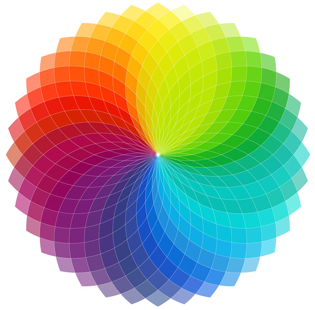
Colors can sway the way people think so it is important to know which colors work well with each other. Imagine you are designing a logo for a store that sells balloons. Your first choice might be to use blue and green because it relates to strength, dependability and prosperity. The three traits that you want associated with the store’s brand. While those colors are great choices, a better application would be to use red instead of green. Red is more effective here because it both causes excitement about your product and is blue’s complementary color on the color wheel, hence creating a very eye-catching effect.
The power of color in design can’t be overestimated – so for your next project, take a spin on the color wheel and experiment with color.


