
Whether you’re a small business, a start-up, or a nonprofit, chances are you’ve considered a few things when it comes to your online persona. Part of that persona includes having an online presence that really speaks to the value of your company and what you represent. Effective websites are crucial to obtaining new donors and volunteers, and they help keep existing community members coming back.
We recently spoke with two organizations regarding their own website design best practices. Charity Miles is a nonprofit whose mission is to get people moving (whether it’s walking, running, or biking) for the cause of their choice. Bright Funds‘ website offers users the chance to discover, donate to, and volunteer for countless nonprofit organizations, all in once place. These two nonprofits function in different capacities, but their respective websites achieve similar success. Here are some of their collective tips on designing a great user experience for your nonprofit.
1. Think big with a small team.
Using the size of your company to your benefit is one of the greatest perks of working with a smaller company. According to Bright Funds’ lead designer, Chris Chappelle, “We’re able to act very nimbly and make quick decisions as a team because we don’t need to go through layers of people for every decision that needs to be made. This lets us make changes much quicker than may be possible in a larger team.” Bottom line: Smaller teams can often achieve bigger and faster results.
2. Establish brand pillars and never lose sight of them.

In order to do anything with your nonprofit, you’ll need to establish brand pillars. Concrete brand pillars are the keys to your success and help relay a clear and concise message. For Bright Funds, the goal is to provide a bridge between the donor and the nonprofit. “While it is important for Bright Funds to have a strong design ethos, we also want to convey the soul of a nonprofit without getting too much in the way.”
It’s a similar story for Charity Miles, as founder Gene Gurkoff says, “We want to create a movement in which millions of people will walk with a cause in their heart everyday. That influences all of the things that we do in our app from a design perspective. We try to keep the website really minimal so that it’ll drive people to the app.”
3. Allow your logo to do some of the work for you.
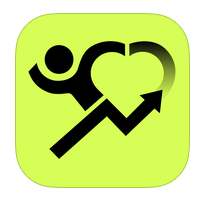

Your logo should achieve a few different things for your business. First, it should be something that people can have a positive association with in relation to your brand. Second, and just as important, it should provide your visitors with a jumping off point for your website and be consistent with the style that you establish afterwards. Gurkoff says, “What I like about our logo is that it can be any color. It can look good on any color and it can work well in almost any situation. We have so many different stakeholders. It’s got to be adaptable and invisible.” A good logo will help you in more ways than one, and can often provide the inspiration you need to build the rest of your visuals.
4. Don’t feel pressured to redesign often.
Just because your competitor seems to be redesigning its site often, doesn’t mean you should. “Nonprofits should think of their sites as living and continually adapting to meet the needs of donors, ” Chappelle says. “We start by creating a site that we think will speak to our audience and their goals, but we continue to tweak language and content to get better and better. If our site isn’t accomplishing some of our initial goals, in most cases, it’s easier to make and test smaller updates rather than undergoing a full redesign.” Have faith in the process that you went through to establish your site in the first place, and avoid frequent overhauls.
5. Remember your audience.

For nonprofits, your audience – donors and participants – helps drive the cause and the story that goes with it. In Chappelle’s words, “For nonprofits, it’s important to put yourself in the world of the donor. Who are they and what do they care about? What type of content and messaging will resonate with them and what do you want them to do? Of course, most nonprofits would love donations or volunteers, but in order to truly harness a strong support base, you need to design a homepage and experience that will tell stories that strike an emotional chord. By doing so, you’ll create a larger and more engaged donor base.” In other words, your audience is what makes the wheels turn for your business. Engagement and value keeps those wheels turning.
6. Create a communal space.

For Charity Miles, though the participants are often separated, they’re a part of a larger community. Their app and (as a result) their website – aim to reflect that. Gurkoff says that by creating both an app and a website to drive people to the app, they were able to “create an openness so that more people would be encouraged to take part.” The website also features a blog, which runs stories from some of the apps users, making space for a community to come together and share happy moments.
7. Consider every color choice.

Similar to logos, color use in web design goes hand in hand with the visual appearance and impression one has when visiting your website, and being a part of your community. For Bright Funds, this ultimately came down to a couple of main ideas. “We wanted to turn the negative connotations that arise when people think about donating and turn them on their head into the powerful belief that people should be able to (and can) support good in the world through causes that resonate deeply within themselves.”
“With this backbone, the visual style and voice of Bright Funds is representative of this – we use colors, illustration, and photography to create an experience that is uplifting and focused on giving as a tool to contribute to something larger than any one person. It’s worth mentioning that while design at Bright Funds does affect the visual choices made, it also roots much deeper into the overall experience of giving,” says Chappelle.
8. Take creative liberties, but not too many.

At the end of the day, your mission is to help better the world in some capacity. Both of these nonprofits put a significant amount of thought into the way they present themselves online. Too much creative liberty can be really stressful, as Gurkoff mentions when talking about Charity Miles.
“We certainly have a lot of creative freedom because we can basically do whatever we want. If you have total freedom, it’s actually really hard.” It’s all about harnessing the right ideas, and sticking to the core values of your organization.

And, if you’re looking for cool, royalty-free images for your nonprofit website, be sure to try a 7-day Free Trial of a Bigstock image subscription. You’ll be able to download up to 35 free images over the course of the trial. Sign up today!
RELATED POSTS


