


1. Stick With Vector
This is my most important rule. When you are designing a logo – stick with vector. It’s easy to forget that a logo used small on business cards and lo-res on websites, may need to be enlarged for a bigger endeavor years later (billboards, for instance). Vector allows you to resize the logo and keep it clean.
2. Keep It Simple
Remember the purpose of a logo. Its job is to easily identify something. So it should be clean, simple, direct and (at least, semi) obvious. A great logo should convey a message, emotion or description in one glance. It also has to be legible large and small.
3. Your Computer Is A Tool
I was taught by the great Charles Goslin to always remember that the computer is only a tool, just like a pen or a ruler. Don’t rely on it to do your designing for you. Sketch your logo out on paper first. A logo should be the essence of what you are trying to convey. By keeping it simple (you don’t have to be able to draw), you can come up with some interesting concepts. Use a thesaurus and a dictionary to jolt your thinking with fresh words and ideas. Only after an effective amount of conceptualizing and sketching will you be truly ready to bring your ideas to your computer.

4. Research, Research, Research
0
0
1
39
227
Shutterstock
1
1
265
14.0
Normal
0
false
false
false
EN-US
JA
X-NONE
/* Style Definitions */
table.MsoNormalTable
{mso-style-name:”Table Normal”;
mso-tstyle-rowband-size:0;
mso-tstyle-colband-size:0;
mso-style-noshow:yes;
mso-style-priority:99;
mso-style-parent:””;
mso-padding-alt:0in 5.4pt 0in 5.4pt;
mso-para-margin:0in;
mso-para-margin-bottom:.0001pt;
mso-pagination:widow-orphan;
font-size:12.0pt;
font-family:Cambria;
mso-ascii-font-family:Cambria;
mso-ascii-theme-font:minor-latin;
mso-hansi-font-family:Cambria;
mso-hansi-theme-font:minor-latin;}
Research your client, competitors, and their audience so you know who you’re designing for. Keep the personality of your client’s brand in the forefront of your mind. Don’t copy or mimic what other logos in the same market are doing, but definitely observe the style and feel of the messaging to get a sense of what is and isn’t working.
5. Think In Color
Your logo needs to be able to work in black & white and in color. I was taught to design in black & white first, and then to add minimal color. Your logo should work inverted as well – with varying dark and light backgrounds. Logos with 1-2 colors are the easiest and most cost effective to reproduce.
6. Be Negative
0
0
1
38
218
Shutterstock
1
1
255
14.0
Normal
0
false
false
false
EN-US
JA
X-NONE
/* Style Definitions */
table.MsoNormalTable
{mso-style-name:”Table Normal”;
mso-tstyle-rowband-size:0;
mso-tstyle-colband-size:0;
mso-style-noshow:yes;
mso-style-priority:99;
mso-style-parent:””;
mso-padding-alt:0in 5.4pt 0in 5.4pt;
mso-para-margin:0in;
mso-para-margin-bottom:.0001pt;
mso-pagination:widow-orphan;
font-size:12.0pt;
font-family:Cambria;
mso-ascii-font-family:Cambria;
mso-ascii-theme-font:minor-latin;
mso-hansi-font-family:Cambria;
mso-hansi-theme-font:minor-latin;}
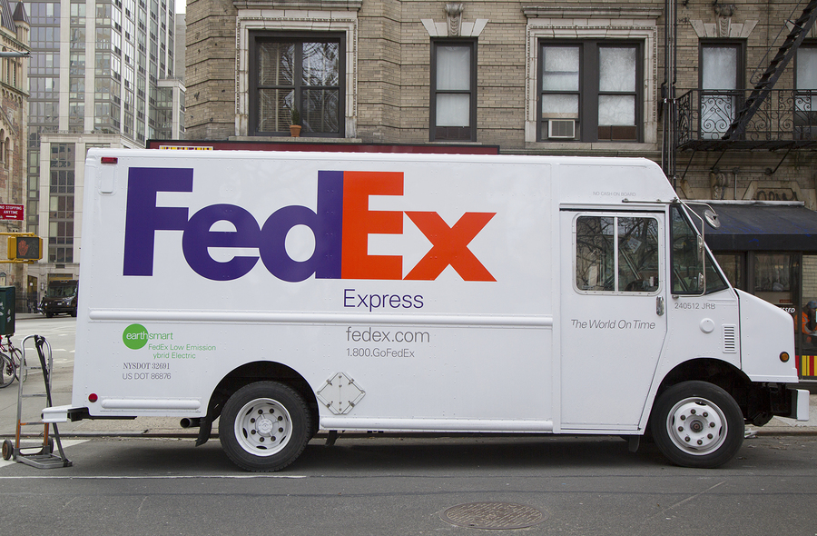
The negative space around your logo is just as important as the shape itself. The FedEx logo shows what is perhaps the most famous use of negative space. (Take a look at the “arrow” in the Ex, right). I’ve also found some great examples in this royalty-free logo collection from Bigstock that show the use of negative space.
7. Play By The Licensing Rules
This is important not only for any stock imagery you may wish to incorporate in your marketing, but for fonts as well. You can’t always use the stock you want in a logo. Same with fonts. Not all fonts require a license, but if the one you’re using does, be sure to purchase it. Fonts are just like stock imagery; someone made it, and he/she is allowing you to use it. For those of you with smaller client budgets, there are lots and lots and lots of free fonts out there to use, just give it a google.
Take care at the beginning, and you’ll be able to create a logo that can stand the test of time. Keep your fonts and colors simple, legible and appropriate for your client and audience. And remember to be patient. A logo takes a while to evolve into greatness, it rarely starts there.
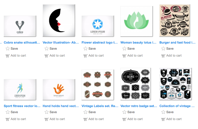
For some great royalty-free images and logo assets, be sure to check out Bigstock.
About The Author

Jessica Furst is a designer. She specializes in event materials, promotional and package design, small business branding and concept development.
She is the founder of Furst Impressions Design in Brooklyn, NY. Visit her biz at www.furstimpressions.com.