

0
0
1
88
505
Shutterstock
4
1
592
14.0
Normal
0
false
false
false
EN-US
JA
X-NONE
/* Style Definitions */
table.MsoNormalTable
{mso-style-name:”Table Normal”;
mso-tstyle-rowband-size:0;
mso-tstyle-colband-size:0;
mso-style-noshow:yes;
mso-style-priority:99;
mso-style-parent:””;
mso-padding-alt:0in 5.4pt 0in 5.4pt;
mso-para-margin:0in;
mso-para-margin-bottom:.0001pt;
mso-pagination:widow-orphan;
font-size:12.0pt;
font-family:Cambria;
mso-ascii-font-family:Cambria;
mso-ascii-theme-font:minor-latin;
mso-hansi-font-family:Cambria;
mso-hansi-theme-font:minor-latin;}
Summer calls for bright, eye-catching colors. This seasonal trend always incites a giddy reaction of joy. It’s only natural to look at a photo and feel happy when the colors are just right. Combining solid colors can be a daunting task though, especially if the colors are already bold to begin with.
Bigstock contributor Evgeniya Porechenskaya seems to have color blocking down to a science. We gathered a bunch of our favorites here, along with some great guidelines for color blocking.
MAKE IT POP
Think of it this way, anything that would work well in fashion, is likely to be pleasing to the eye. In this case below, the red polka dots instantly attract attention. The pairing of opposing colors like yellow and aqua really make the white dots pop.

SET THE TONE
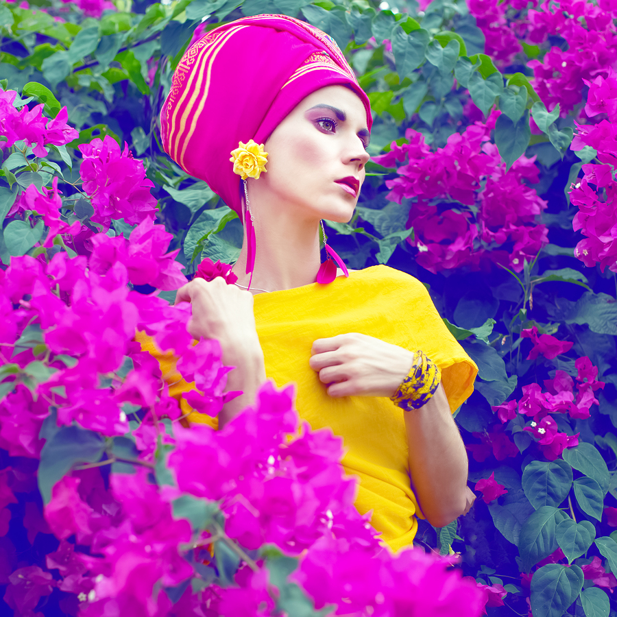
A seamless setting or solid background makes for a perfect backdrop for a bold color like yellow. The magenta hue changes help bring each detail to the forefront.
0
0
1
9
53
Shutterstock
1
1
61
14.0
Normal
0
false
false
false
EN-US
JA
X-NONE
/* Style Definitions */
table.MsoNormalTable
{mso-style-name:”Table Normal”;
mso-tstyle-rowband-size:0;
mso-tstyle-colband-size:0;
mso-style-noshow:yes;
mso-style-priority:99;
mso-style-parent:””;
mso-padding-alt:0in 5.4pt 0in 5.4pt;
mso-para-margin:0in;
mso-para-margin-bottom:.0001pt;
mso-pagination:widow-orphan;
font-size:12.0pt;
font-family:Cambria;
mso-ascii-font-family:Cambria;
mso-ascii-theme-font:minor-latin;
mso-hansi-font-family:Cambria;
mso-hansi-theme-font:minor-latin;}
Here (below) is another example of this same color concept.

0
0
1
26
152
Shutterstock
1
1
177
14.0
Normal
0
false
false
false
EN-US
JA
X-NONE
/* Style Definitions */
table.MsoNormalTable
{mso-style-name:”Table Normal”;
mso-tstyle-rowband-size:0;
mso-tstyle-colband-size:0;
mso-style-noshow:yes;
mso-style-priority:99;
mso-style-parent:””;
mso-padding-alt:0in 5.4pt 0in 5.4pt;
mso-para-margin:0in;
mso-para-margin-bottom:.0001pt;
mso-pagination:widow-orphan;
font-size:12.0pt;
font-family:Cambria;
mso-ascii-font-family:Cambria;
mso-ascii-theme-font:minor-latin;
mso-hansi-font-family:Cambria;
mso-hansi-theme-font:minor-latin;}
MEET SOMEWHERE IN THE MIDDLE
White and neon pair beautifully together, as the background is a middle ground between the two colors. This makes for a well-balanced photo, even with these edgy color combinations.

0
0
1
25
145
Shutterstock
1
1
169
14.0
Normal
0
false
false
false
EN-US
JA
X-NONE
/* Style Definitions */
table.MsoNormalTable
{mso-style-name:”Table Normal”;
mso-tstyle-rowband-size:0;
mso-tstyle-colband-size:0;
mso-style-noshow:yes;
mso-style-priority:99;
mso-style-parent:””;
mso-padding-alt:0in 5.4pt 0in 5.4pt;
mso-para-margin:0in;
mso-para-margin-bottom:.0001pt;
mso-pagination:widow-orphan;
font-size:12.0pt;
font-family:Cambria;
mso-ascii-font-family:Cambria;
mso-ascii-theme-font:minor-latin;
mso-hansi-font-family:Cambria;
mso-hansi-theme-font:minor-latin;}
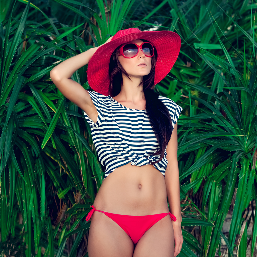
Below: The bright red of this model’s hat is offset by the background’s green grass. A center piece, like stripes, which can sometimes be dull, are now bold and textured.
Be sure to check out our lightbox of curated color blocking examples for even more inspiration!