
Some designers believe that fonts exist only to be read, not admired. And, yes, it is true that choosing a font simply for its looks may not result in effective website design. If you’ve ever struggled to read a web page written in ornate typography, or white text on a black background, you know what we’re talking about.
On the other hand, if you choose fonts purely for readability, you may end up with a website that lacks personality. Choosing the “best” fonts doesn’t mean that you need to use only the ones that look professional. Instead, you need to learn how to use fonts—both fun and formal—in a professional way. Certainly, some fonts are more professional than others, so let’s take a closer look.

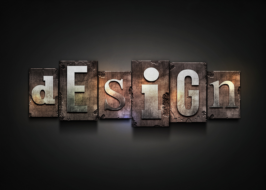
The Psychology Surrounding Fonts
While style and branding are important, they aren’t the only factors that you should consider when choosing your business site fonts. Different typefaces actually have the ability to affect the way your readers think.
For example, a 2012 study conducted by Errol Morris shows that different fonts affect the believability of the information being presented. Participants were less likely to accept statements written in Comic Sans and Helvetica as true, and were more likely to believe those same statements when presented in Baskerville.
In another study, this one by Norbert Schwarz and Hyunjin Song, two groups of participants were asked to read a set of instructions about how to do a task. One group received their instructions in Arial, and they estimated that the task would take 8.2 minutes to complete. The second group received instructions in Brush, which is a script-style font. The increase in reading difficulty led this group to estimate that the task would take 15.1 minutes to complete—nearly twice as long.
To get across how important fonts are, here is one last marketing study: One group of participants was given a restaurant menu that was printed in a simple font, and the other group received the same menu printed in a fancy font. Those who read the fancy-font menu automatically inferred that the chef was more skilled. Keep this in mind if you are selling a high-cost service or product on your business site; you may want to use a fancy font (more about that later) to convey a higher value to your potential clients.

Serif or Sans Serif?
Some designers make the mistake of assuming that the same fonts they rely on for printed copy will be just as effective on a website. Serif fonts, such as Times New Roman and Georgia, are the standard for printed works, but most web experts say that sans serif fonts like Arial are best for web copy.
A serif is the little flourish at the end of each stroke on every letter, which makes them more distinct and easier to read on paper. But, because of this same detail, serif fonts don’t always translate well to the screen. For serif fonts to have the same online readability as sans serif fonts, they need to be displayed at a larger size or at very high resolutions, which isn’t always possible on older monitors or smaller mobile screens.
Remember, the primary goal for choosing your font should be readability. Since Internet readers have little patience, you’ll want to make their experience on your site as easy and pleasant as possible. So for online copy, it’s best to go with one of the following:
- a sans serif font like Arial 12-point in general
- a sans serif font Verdana 10-point for smaller print
- a simple serif font like Georgia 12-point if you require a more formal look
How Many Fonts Do You Need?
There is no hard and fast rule that determines how many fonts you’ll need on your website. Instead, the number of fonts you choose should be based more on the visual hierarchy of a particular page. A blog post that features a title, subheadings, and blocks of text may only call for two or three fonts — and that’s only if you want to draw extra attention to your titles and subheadings.
In addition to fonts for text, titles, and subheadings, you may want to choose attractive, complimentary typefaces for company graphics, menus, and calls to action.
While several different fonts can work together to create an attractive page, you also have to balance your choices with a “less is more” concept so that your pages don’t look too cluttered.
Here are four things to keep in mind when choosing your fonts:
- Mood. Ensure that the font’s personality evokes the desired emotional response of the content.
- Design Intent. Cooper Black is a great font for a sign, but not so appropriate for an article.
- Aesthetics. Keep in mind what your audience expects. In other words, Comic Sans is inappropriate for a law firm’s website. A good choice would be the classic serif font Garamond, which evokes a solid, trustworthy image.
- Originality. Rather than choosing obvious fonts like Papyrus for an “ancient” subject or Futura for a “futuristic” topic, consider using casual scripts or calligraphic fonts, which can be elegant, quirky or individualistic.

Using Text Effects
Rather than simply adding more fonts, consider text effects—an excellent way to make words, phrases, titles, and subheadings stand out. Here are some of the ways you can use them:
- Colors. Use colors not only to highlight bits of text, but to make your hyperlinks more clickable.
- Bold. Bold fonts are regularly used for titles and subheadings, but they can also be used to highlight key words and phrases.
- Capitalization. You can use all capital letters (yep, ALL CAPS) to make titles, ledes, and subheadings more authoritative.
- Italics. Italicized words can naturally be used to emphasize words and phrases. However, words in italics are sometimes difficult to read, which means that you may want to choose a different font before using this effect.
The key to using text effects while maintaining a high level of professionalism is to use them sparingly. For instance, your readers’ eyes will be drawn to a capitalized word or phrase within a blog post, but if you start capitalizing entire sentences, your audience may feel like you’re shouting at them. Bold lettering makes important points stand out among blocks of text, but if you use bold fonts too often, they’ll lose their dramatic effect.
Learning about the psychology behind typeface, how to choose the right number of fonts for your website, and how to use text effects to the greatest advantage will help you build a business website that doesn’t sacrifice your brand’s personality.
RELATED POSTS:


