

If you’ve seen some of Bigstock’s inspiring posters, you might be interested in learning some typography principles yourself. When designing layouts and setting type, it is important to understand the basics of working with text, line spacing, and letter spacing. This tutorial will cover leading, kerning, tracking, and when and how to apply them.
First, here’s a rundown of Photoshop’s character palette, which is where all of these properties are edited. The character palette can be accessed in Photoshop in Window > Character.

Leading
When working with a paragraph, or just more than one line of type, leading is the distance between the baselines in the paragraph. A baseline is the imaginary guideline that type sits on.

The standard porportion of leading to type size is typically 120%. So if the type size is 20 point, then the most standard leading would be 24 point.

Expanding the line spacing, or increasing the leading from 120%, creates a lighter more open text block. As leading increases, lines of type become more independent graphic elements rather than parts of a paragraph.
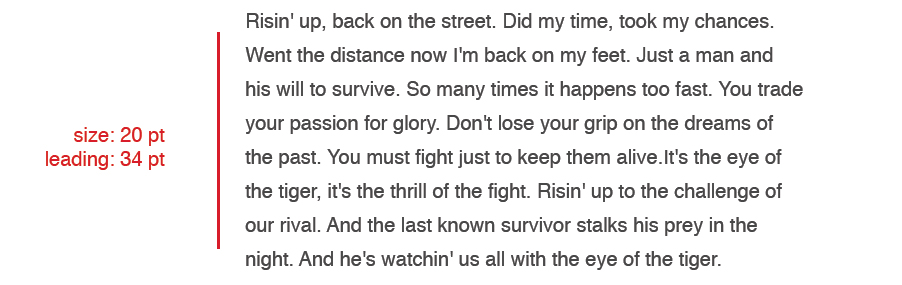
Reducing the leading from 120% creates a denser element while risking collisions of ascenders and descenders (see the “Eye of the Tiger” above).

To adjust the leading in Photoshop, use the leading field in the character palette while the type layer is selected. For a quick shortcut, hold down the option key and press the up/down arrow keys while the actual text is selected.
In some cases you might have lines of text that are smaller or larger than the other lines of text. In that case, the leading of those lines should be adjusted individually. For the below example, the leading of “of the” is being increased.


Kerning
Kerning is an adjustment of space between two specific letters. The goal of kerning is to create a consistent rhythm of space within a group of letters and to create an appearance of even spacing between letters. Fonts have exact amounts of spacing between letter combinations already built into it, which is called Metric Kerning. Type takes on Metric Kerning as a default. As type gets larger and closer to a headline size, those letter combinations, or kerning pairs, don’t work as well. If a selection of type is changed to Optical Kerning, photoshop (or whichever program is being used) will adjust the kerning automatically. However, most designers don’t find this is as useful as using Manual Kerning.
Manual Kerning – One helpful way to look at kerning is imagining that each space between kerning pairs is filled with liquid, and the same amount of liquid should put poured into each space.


Kerning can be manually adjusted in the kerning field in the character palette while the cursor is between two letters. But the faster and more commonly-used way is to use the shortcut by placing the cursor in the space you would like to kern, then hold down the option key while pressing the left/right arrow keys. Each click of the arrow key will adjust the kerning a little bit at a time. You can specify this increment in the preferences of Photoshop (or whichever program you are using). Most people prefer to be very precise by adjusting kerning by 1 or 2 points at a time.
Here are a few important things to remember while kerning:
1. Start with the most difficult pairings, like capital/lowercase pairings, diagonal letters and round letters.
2. Adjust kerning as a last step in your design, and especially after you choose a font. Every font is different.
3. Try turning your type upside down and kerning it. Sometimes kerning can be missed because your eyes tend focus on the whole word or sentence.
4. The goal of kerning is for the type to look optically correct. There is no mathematical formula, and often times it just takes practice. Try this kerning game.
Tracking
Kerning should not be confused with tracking, which refers to uniform spacing between all of the letters in a group of text. By increasing tracking in a word, line of text, or paragraph, a designer can create a more open and airy element.

In blocks of text or paragraph, tracking is usually only increased by a small amount, because the legibility can become difficult. In that case it is used more subtly and sometimes to fill space. And using negative tracking can be used sparingly to help create a shorter line of text. In smaller amounts of text or single lines, tracking can be increased in greater amounts and can often help the font take on an entirely different design quality.
To adjust tracking, use the tracking field on the character palette. For a shortcut, select the text you would like to track, and hold down the option key and press the left/right arrow keys.
These typography principles of leading, kerning, and tracking can be applied to Bigstock’s lettering images. We’ve put them in practice In the example below using some tiger-ish letter images.

And, if you’re new to Bigstock, why not sign up for our 7-day Free Trial? You’ll be able to download up to five stock images each day, for seven full days. Have fun.

Check out some more of Bigstock’s lettering images in this lightbox.

RELATED POSTS:

