
A well-done opening title sequence can be a beautiful place where filmmaking and graphic design come together. Title typography should be considered a moment in design history. Sure, all of the Oscar nominees were released in theaters, but how many will survive for years to come as works of art?
With the 2014 Academy Awards coming up, let’s take a close look at some of the title design sequences from the list of Best Picture nominees. Even though there seemed to be a common theme of white type on black background this year, the title designs were strong. Here are some of my favorites.
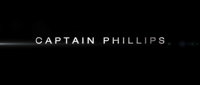
Captain Phillips
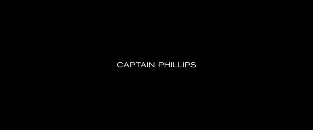
Captain Phillips is an intense film that’s based on a true story and full of danger and suspense. The title sequence, designed by Matt Curtis, is sensitive to the serious story by visually portraying something scary but not flashy. This ‘non-flashiness’ comes across in the simple font Akzidenz-Grotesk, yet the quiet drama is still coming through on screen. The pared-down design assists the filmmakers in addressing some real-life issues and should stand the test of time.


Dallas Buyers Club

Dallas Buyers Club is also inspired by a true story. Though the film deals with a serious subject, the exciting story surrounding the subject matter is what really makes the movie. The title designer created some simple yet dramatic designs. Times New Roman font is not something I would have chosen, but it seems to work at a smaller size, and it’s certainly classic. It seems to bring the Texas theme to the forefront in a subtle way. After watching Dallas Buyers Club, and looking at some of the marketing posters like this one and this one and this one, I do wonder what these titles could’ve looked like if there was some color variations to capture the compelling storyline. The photos in the posters have a sort of washed-out 1980’s look, and I think these titles could have used some of that texture.


Nebraska
The title sequence for Nebraska, done by Eric Ladd, is spot on. The movie, flat and understated, was beautifully shot in black and white, and has a great deal of dry humor. These titles were the simplest of simple with an all-caps Helvetica, but the designer still created something interesting by placing each title sequentially down the screen.


Gravity
The titles of Gravity, by Gonzalo García Barcha, are certainly a calm before a storm. They make it perfectly clear that space is terrifying. They also seem to say, “get ready, because some bad stuff is about to happen.” I really dig the eerie quiet font.


I really love the final Gravity title card because it compliments the theme of loneliness in space, and it goes along well with some of the marketing images.

Her
Yay, color! Her is an absolutely beautiful movie full of happy lighthearted colors and smooth futuristic lines. The opening sequence of Her, designed by Geoff Mcfetridge, was the most successful at fitting right in with the brand of the movie. I would describe the theme of this movie as “some hope amongst sadness and loneliness,” which is perhaps the theme of the titles as well. I see a few kerning problems here, which is surprising. Maybe it would have been better if the titles were kerned as tight as the logo, but perhaps that would’ve been a bit harder to read.


… AND MY OSCAR FOR BEST TYPOGRAPHY IN A MOVIE TITLE SEQUENCE GOES TO …
12 Years a Slave
12 Years a Slave is an extremely sad and heavy period film that’s based on a true story about slavery, and of course, takes place before computer keyboards or even Bic pens existed. These beautiful titles are particularly cool because they are fontless! According to the designer Antony Buonomo’s portfolio site, they were made with calligraphy and letterpress printing. I really love how authentic and imperfect these titles are. The lettering also features a mixture of small caps, italics, and ink bleeds that encompass what printing was like during the 1800’s. As you can see from the video of (what I think are) the closing titles, the main 12 Years a Slave title card is lit by a flickering lantern, which reminds me of the scene when the enslaved Solomon Northup tries to secretly write a letter to his family.


The below production designer credit is perfect in that it suggests how the calligrapher’s ink may run out while he pens a name.


Which film’s opening sequence grabbed your eye? Let me know. And, if you can’t get enough Oscar fun, be sure to check out our Best Pictures series, filled with fun, film-appropriate collections of royalty-free images. Happy Oscars!
RELATED POSTS:


